Overview of The New Amazon Fire TV Update Does Not Address Any of the Issues — and Here Is Why
The Fire TV update finally added user profiles and app-specific preview rows, useful for families and personalized recommendations. However, the interface increasingly prioritizes Amazon-owned content and ads, with Prime Video banners dominating the home screen. Navigation changed to central Home, Find, and Live tabs plus a less-visible Apps button, making app discovery harder. Sponsored rows and repeated Amazon promotions persist throughout the UI, leaving the overall experience cluttered and favoring Amazon services over a neutral streaming platform.
Quick Solutions to Questions related to Fire TV Update:
-
What is the biggest new feature in the recent Fire TV update?
The biggest new feature is support for different Fire TV user profiles for personalized recommendations and apps. -
Does the update improve content previews in apps?
Yes, some applications now have a preview line showing lists of similar shows, though availability varies by app. -
How has the home screen navigation changed?
Amazon removed top navigation buttons and added Home, Find, and Live tabs in the centre, plus a Settings gear and an Apps button on the right. -
Has the update reduced Amazon promotions and ads?
No, the home screen still emphasizes Prime Video content and includes multiple sponsored rows and ads throughout. -
Can multiple Fire TV devices share the same Amazon account easily now?
Yes, profiles make it easier for multiple devices to use the same Amazon account while keeping individual experiences.
The most recent Amazon Fire TV update took a long time to arrive, and I don’t think it was worth the wait. Though it does have one new addition that some families will likely enjoy, it’s ultimately yet another upgrade that leaves Amazon at the bottom of the streaming platform interfaces.
Let’s back up for more context so this might be a case of so much anticipation leading to higher aspirations. Amazon revealed in September 2020 that it was upgrading the Fire TV user interface with a “modern Fire TV experience” that updated the OS’s architecture. And when Amazon said the updates would start “later” that year, it wasn’t lying: they came in December 2020. However, not all Fire TV systems have it.

The big news is that you can have different Fire TV user profiles. This is good for customized recommendations, and getting to see just your apps. For houses that have multiple Fire TV devices, this also makes it easier for everyone to be on the same Amazon account (to share Prime Video access), while just getting their own experience. Just because I downloaded Peacock for WWE doesn’t mean the rest of my household needs to have Peacock in their row of the top 5 apps (more on that later) on their home screen.
In addition, some applications also have preview line, where you can see a list of similar shows. Such smartphones, predictably, have more content than others. Netflix, Disney Plus, and Hulu have just one row of videos, while Amazon’s Prime Video and IMDbTV (owned by Amazon) have several rows. This is in line with Amazon’s Fire TV strategy, which is to basically have more of anything owned by Amazon.
What’s the problem now? (and what got worse)
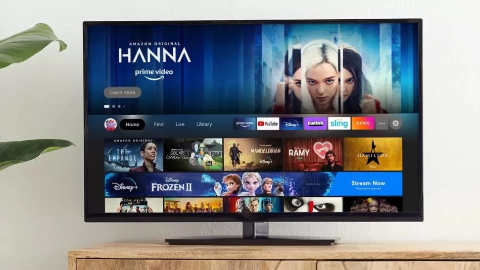
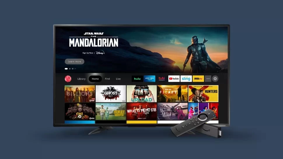
The Fire TV operating system is now mostly a conduit for Amazon content. The banner for Prime Video Services, movies you can rent from Prime Video, and shows on Prime Video that you might have little interest in remains at the top of the home screen. The HBO Max app’s Game of Thrones Iron Anniversary stream seems to be a remarkable exception.
Amazon has also removed the top-of-screen navigation buttons, replacing them with Home, Find, and Live tabs in the centre of the screen, as well as a Settings gear on the right next to an Apps button. I wish the Apps icon (a box with three boxes inside) was more noticeable, as it is only visible when you mouse over it. My father couldn’t figure out what it was when I revealed it to him.
The home screen still includes more advertisements below the top half of the screen, possibly because Amazon knows it’s trained people to ignore the content on that half. Scrolling down, I find a Sponsored row, promoting Discovery+ via Prime Video Channels, and when I hover over that — I see and hear an ad in the top right corner.
Smart Home: How To Reset A Roku Remote
The rows labelled “Free to me – Amazon Channels” and “Popular TV on Prime Video Channels” are a little annoying, but I’m used to it from Amazon at this stage. The former is arguably cool because it makes you find meaning in what you already paid for, but the latter is full of things I don’t care about (no, I’m not interested in Star Trek: Lower Decks, an animated film, and can The Walking Dead please come to an end already).

A few rows further down, more sponsored content! This time, it’s Apps & Games! And this cadence repeats itself, like the Instagram Stories carousel. A bunch of your stuff, then something from Amazon, and so on.


